top of page


Book Cover Designs by Chris McNulty


Hello, David!
It’s a pleasure to work with you again. Thanks as always for your reference material. I wish that all of our customers would communicate their vision as clearly as you do. It really helps us get an idea of where the material should go, and lets us steer with our design input accordingly. Such valuable time spent, and I thank you for doing so.
I can see where you were going with the Godfather reference. However, I thought that the Godfather theme, even distilled to be a subtle nod to it, might distract a bit from the main visual goal and intent of the book. Also, the Godfather reference makes some jump right to the mobster vibe, and I didn’t want your educational and empowering message to be clouded by that; I wanted the ideas of information, technology, empowerment and positivity to shine.
When it comes down to best-selling books, in my experience it’s often the focused designs that win. I centered the theme around a woman at the computer investing online, with data trends superimposed throughout the composition that spans the cover. Business and Finance books by design tend to be a bit more conservative. I kept that in mind during the design process and maintained a conservative yet modern look, a refined business approach with artful cropping and flair, while keeping a similar aesthetic to your novels for continuity across your product line.
As always, it brings me joy to help you bring your vision to life. This is a great book, and I hope that you like the design! All the best to you and yours this holiday season!
Sincerely, Chris
Hello David!
I hope this note finds you well - Happy New Year!
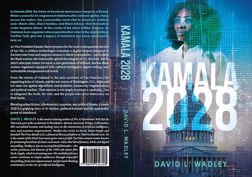
After watching your video and formatting your content first so that I might get a true feel for the story, I embarked upon the cover design. I initially wanted to somehow incorporate Kamala herself at least as a silhouette figure, though there is very limited stock imagery that is available of political figures for use outside of editorial purposes.
I gave it some thought and decided to focus on your character, Mika. I wanted to depict her in a very technical, focused, data-driven setting, amidst The Capitol and a technocentric city skyline that was melding with data that she is in control of. I felt that this combination, with textural effects to make it almost painterly in a futuristic way, yielded a very powerful and intriguing cover that is sure to draw your readers into the story and provide a strong visual accompaniment.
As always, it is a pleasure to work with you, and I do hope that you like the design!
All the best to you,
Chris
P.S. - GO KAMALA!!!


Hi David, Chris here.
Glad to see that you are back with a new book! Sales passed along your message to me. I was thrilled to hear it and psyched to lend a hand. I read over all of your notes and watched your video to get the full immersion into the story. I gave it a lot of thought, including making sure that the presentation stands on its own while also being cohesive with your previous title, with respect to the design aesthetic and execution of concept.
As with any design project, I look at the notes and made a list of key elements, essentially a visual communication plan. I want to share where my head was at based upon your vision, and my knowledge of what works well on the retail shelf (or screen). - Your first book had a lot of depth. It was textural, mysterious, and also visually engaging in its own right (color, composition, typography). I wanted to carry the same vision here - honor the nuances of the story without giving it all away.
I want the potential reader to walk across the bookstore first because they notice a compelling image. Then, when they look at the image, I want them to be intrigued and want to know more of what it’s all about.
This isn’t a basic story. You’ve got many complex levels within the characters which deserve that intrigue. - For the focal point, I wanted to convey the main character’s struggle and journey in a powerful way. His yearning for significance. His exploring nature. His path that began with and returns to love. I immediately thought… what are the two counterpoints here? The answer is love and closeness versus solitude.
My mind immediately went to the visual of him standing in paradise, alone against the vast sea, with an almost dreamlike montage of his hand holding Nubia’s. I think it is the perfect representation of this love. The joining hands represent the beginning, the dream of return to that love, then the eventual return to love all in one powerful image. Universal connection. - Once I had the key visuals down, it came time to embellish with more subtle clues about the story.
The front cover’s image is the Philippines, tinted with a dramatic sunset. Overlaying the scene are passport book stamps that signal travel abroad without being so obvious as a US Passport book itself. It respects the depth of the travel aspect of the story while adding to the compelling composition. - Like your first book, I wanted the image to span across the front and back, tying it all together. I chose an image of Ecuador, tinting the image back so it is true to the landscape but also text-friendly (didn’t want it so busy that the back cover text got lost.)
Using Photoshop, I blended the two worlds together from the front and back using blending and image masking tools to make it seamless. I feel that the green rainforest juxtaposed against the orange sunset provided a captivating complimentary color combo. It feels good to me. Warm, adventurous, vibrant, alive. - For the typography, I tried a few different typefaces, though felt the best one for this title was one that had a rough yet timeless appearance. I wanted it to look stamped, worn, to support the well-traveled nature of the character. I set it in a color that is intentionally complementary and cool in tone, so that it jumps off of the vibrant sunset background.
Your author name I chose to keep the same as your previous book for consistency. Like your previous book, this sans-serif pairs extremely well. - For a moment while I was working on the composition I had considered including an element of financial markets and tech to support that element of the story. Though when I tested it, it was more visually competing than supportive. The tech aspect and the travel/relationship arcs, although they work in the story, did not work well with the several other key visuals going on. That kind of thing happens, and it is perfectly OK. The reader will be able to pick up on and appreciate that aspect of the characters as they dive into your story.
Thank you for taking the time to read all this! I hope it helps to convey the interpretation of your vision. It’s gonna look great, and cool in that video spot too! If there’s anything else you need just let our Editorial Coordinator Team know and I’ll do my best to make it happen.
All the best to you!
Sincerely, Chris

Good afternoon, David - I hope all is well with you.
I was thrilled again to see that you are here with the third installment of your work! I read all of your materials and watched your video as well to immerse myself in the theme. I’m pleased again to see that you have again woven a complex story with a lot of depth.
I wanted to follow through with the graphic design in a way that conveyed the depth of the story in an artful and focused way. I felt that this story called for a visual embodiment of the two strong female characters.
I’ve rendered Nubia and Onyx as the focal point of the cover, standing back to back in an iconic pose, arms crossed and back to back, signifying strength and unity. Using a similar technique as on your previous covers, I blended them with a dramatic time lapse photo of the Atlanta skyline. Within the composition, I have also subtly woven in a montage of financial digital data displays that supports their rescue mission: educating and empowering the victims via online stock trading, bringing about financial independence within the AI revolution.
The juxtaposition of these elements visually worked very well together in my opinion, and provide intrigue to draw in the potential reader across the bookstore to pick this up and have a close look. For the typography, I was inspired to take a street smart vibe to accompany their professional and intelligent look, adding depth and a bit of visceral urban power. Like tagging something in the city to leave your mark.
These powerful and intelligent women know their way around the modern world, finance, technology and can also say, “back up, this is our turf”. Again, as always, it’s a real pleasure helping to bring your vision to life. I do hope that you like it!
Sincerely, Chris.
bottom of page